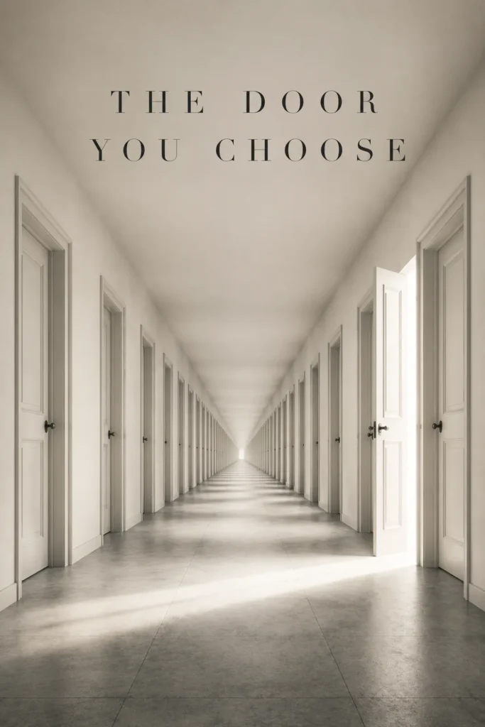
—Book Cover Design Services
Book Cover Design Services That Win the Split-Second Scroll
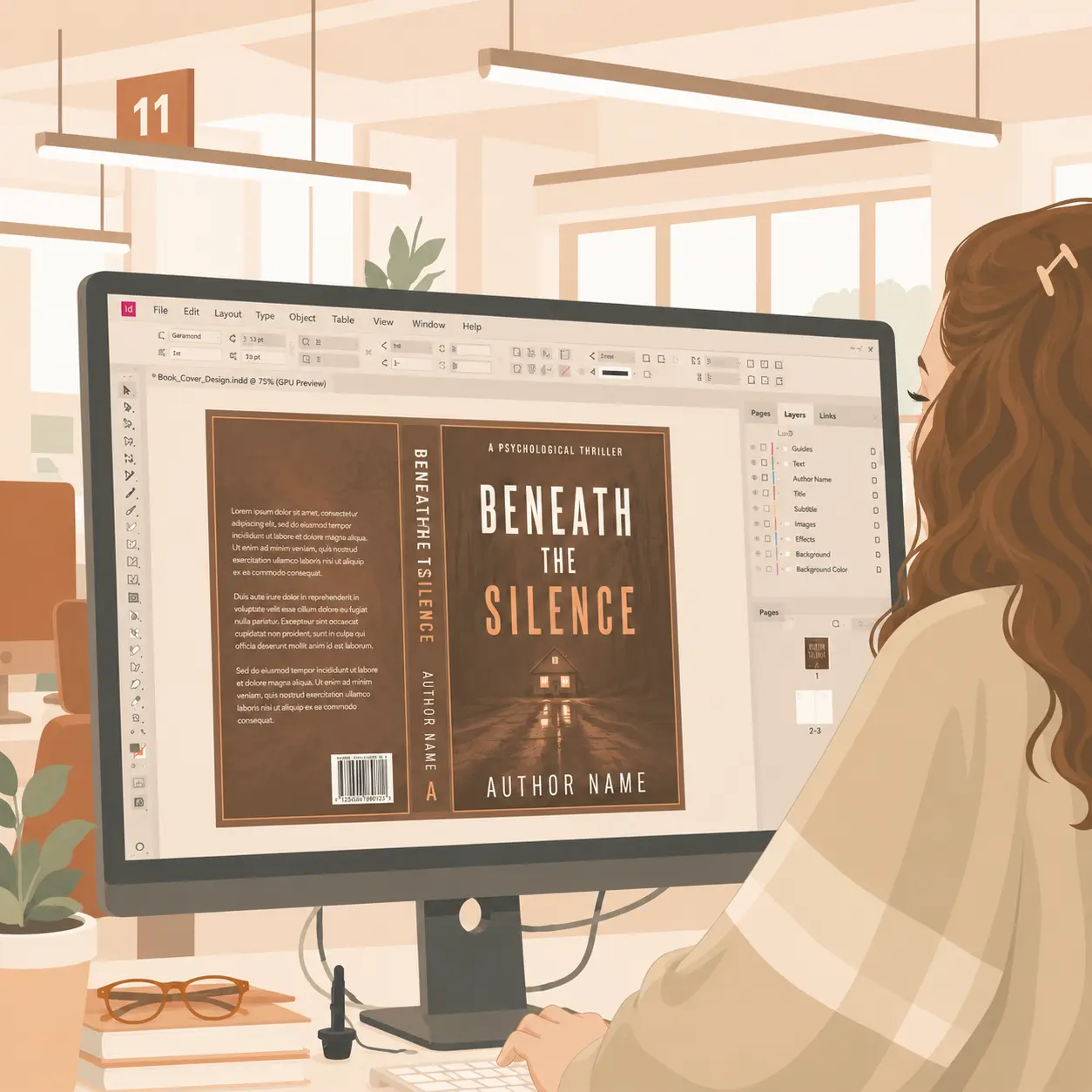
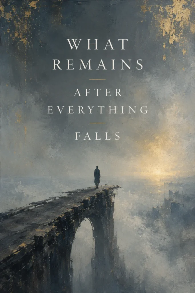
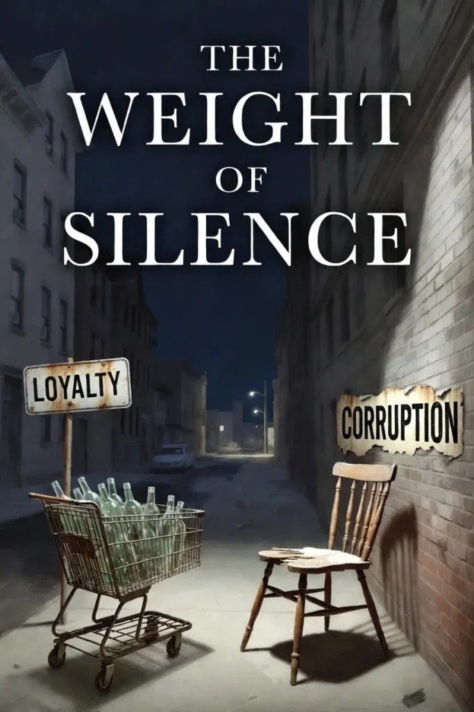
Book cover design services translate a manuscript into the visual conventions readers in a specific subgenre already recognize, so the cover earns the tap in the thumbnail glance before the title is read. AuthorWings runs three tiers from $199 (ebook) to $999 (custom illustration plus series branding), each briefed against three to five comp titles on the same Amazon shelf.
—WHY IT MATTERS
Why book covers win or lose at thumbnail size
It is 11pm. A reader thumbs through Amazon on her phone, half-tired, half-curious. Covers appear at thumbnail size, packed shoulder to shoulder with dozens of competitors in the same category, and her eye sorts them into “looks like my next read” and “looks like everything else” faster than conscious thought — before the title is read, before the author name registers, before any rational evaluation of the blurb. Cover design is not decoration. It is the single highest-leverage marketing asset a self-published author owns.
What the brain is reading in that window is genre, and it is reading it across every surface the cover has to survive: the Amazon grid at 160 pixels, the BookBub email at thumbnail, the Instagram carousel, the printed spine on a shelf, and the same cover scaled to 1600 pixels on a desktop product page. A romance reader recognizes a romance cover by color saturation, typography, and figure placement before she reads a single word.
A thriller reader recognizes a thriller cover by negative space, sans-serif weight, and a single high-contrast object centered low. A literary fiction reader recognizes a literary cover by restrained palette, painterly imagery, and a quiet typographic hierarchy. These conventions are not accidents. They are decades of publisher A/B testing baked into reader expectation, and breaking them by accident is the most common reason a well-written book fails to sell.
This is also where amateur covers get punished. A romance cover with the wrong typeface signals “self-published” before it signals “romance.” A thriller cover with stock imagery the reader has seen on three other thrillers signals interchangeable. A literary cover that copies a current bestseller signals derivative. The penalty for each mismatch is not a complaint or a refund. The penalty is silence. The cover gets scrolled past, the algorithm registers the lack of clicks, and the book sinks below the fold in category search results within days.
A cover designed for the thumbnail test is built backwards from that constraint: it works at 160 pixels before 1600, and it earns the tap by looking like the kind of book a particular reader already pays for. That is the test professional book cover design services are engineered to pass.
—PORTFOLIO
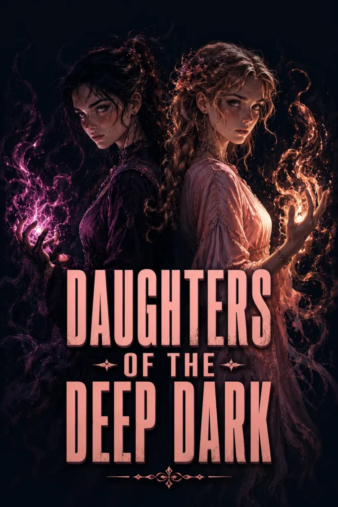
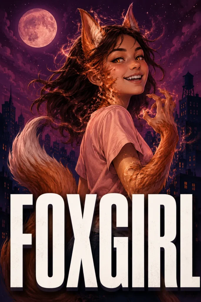
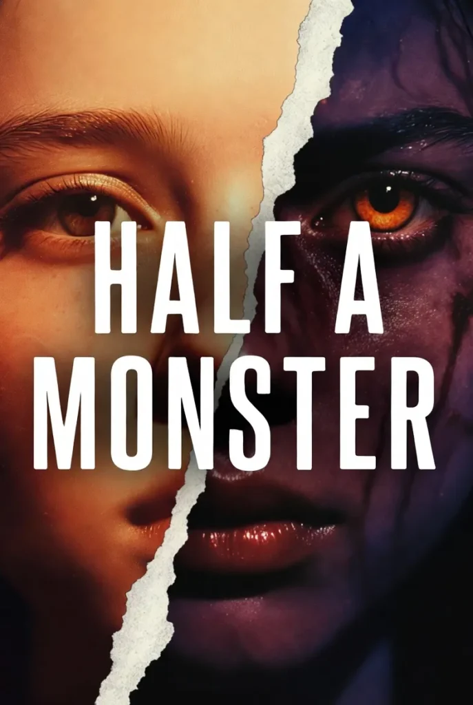
Book cover design portfolio across every genre we work in
Covers built for the categories AuthorWings designs most often. Each one was briefed against its exact subgenre, tested at thumbnail size, and delivered in print-ready files. Filter by genre to see the conventions in action.


—WHAT YOU GET
What every book cover design service should include
Most authors comparing book cover design services get lost in price tags and miss the line items that actually separate a working cover from a wasted one. The work breaks into three phases, and a cover skipping any of them tends to look like exactly what it is.
Strategic Discovery
A working brief starts with comparable titles in the exact subgenre, not the genre. Romantic suspense is not contemporary romance. Cozy mystery is not psychological thriller. The discovery phase pins down the three to five comp titles the cover will sit beside on Amazon, identifies the visual conventions those covers share, and locks in the mood, palette, and typographic register the reader expects. Skip this and the designer is guessing. Guessing is what produces covers that look generic to every reader except the author.
Concept Iteration
A single concept on a first pass is not enough range to make a real choice. Professional services present multiple concepts at the start, then run revision rounds on the chosen direction. Each round sharpens type weight, color contrast, image cropping, and thumbnail legibility. The number of rounds matters less than what happens inside them. A round spent fixing kerning is a different conversation than a round spent rethinking the entire visual direction, and a tier worth paying for protects time for both.
Format and Files
A cover delivered only as a flat ebook JPEG is half a deliverable. A complete handoff includes ebook dimensions sized to KDP, Apple Books, and Kobo specs, paperback wrap files matched to print trim and spine width, hardcover dust jacket where the project calls for it, and layered source files the author keeps. Source files matter the moment a sequel arrives, a price sticker needs adding, or a marketing asset has to be cut from the original art. Without them, the cover is rented, not owned.
—GENRE CONVENTIONS
Genre conventions readers recognize before the title
Every category on Amazon has a visual code. Readers who buy in that category have absorbed the code through hundreds of past purchases, and a cover that breaks the code accidentally signals “wrong shelf.” Nine examples of how this plays out across the genres AuthorWings designs most often.
Nine Genre Visual Conventions, Decoded
What readers unconsciously decode in the thumbnail glance. Once you see the patterns, you can never unsee them.
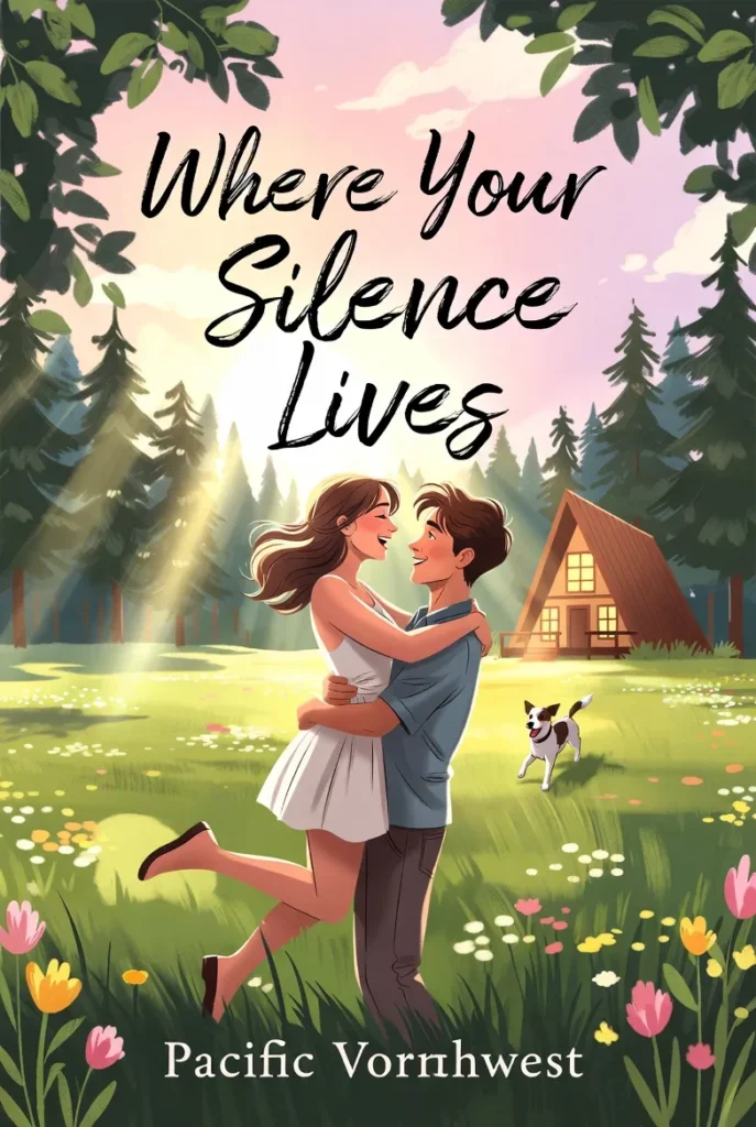
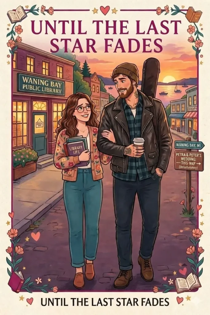
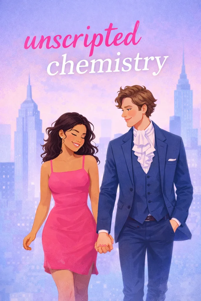
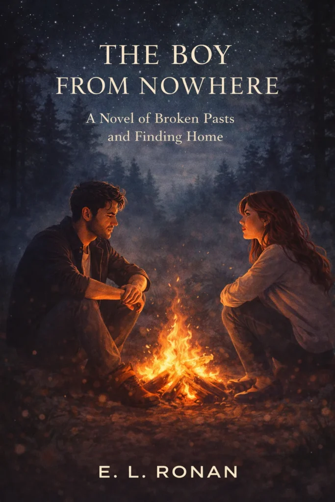
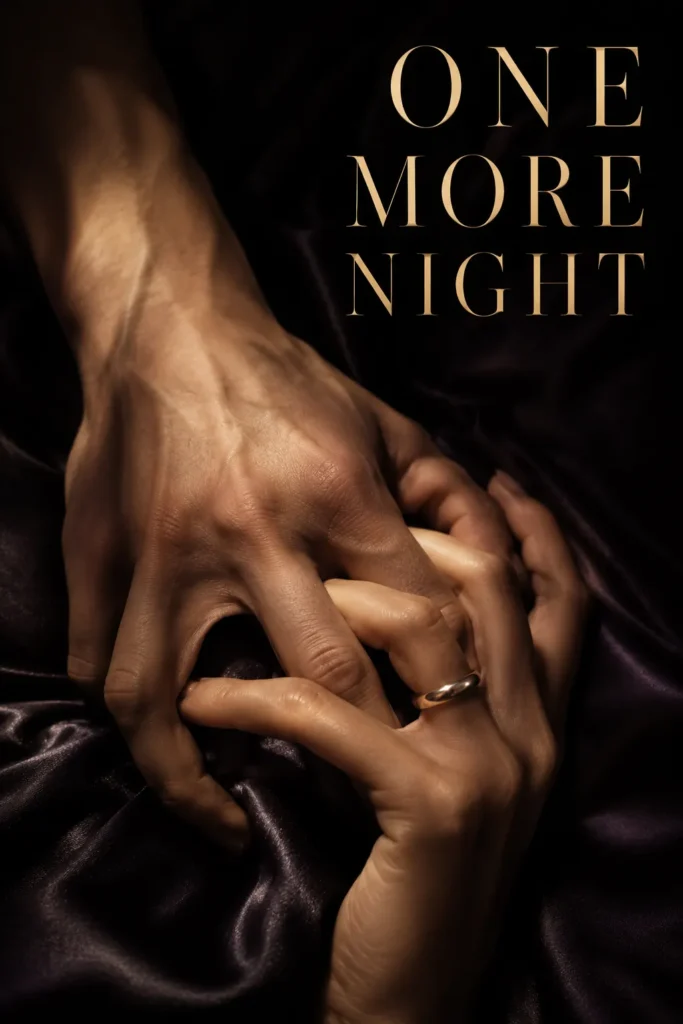
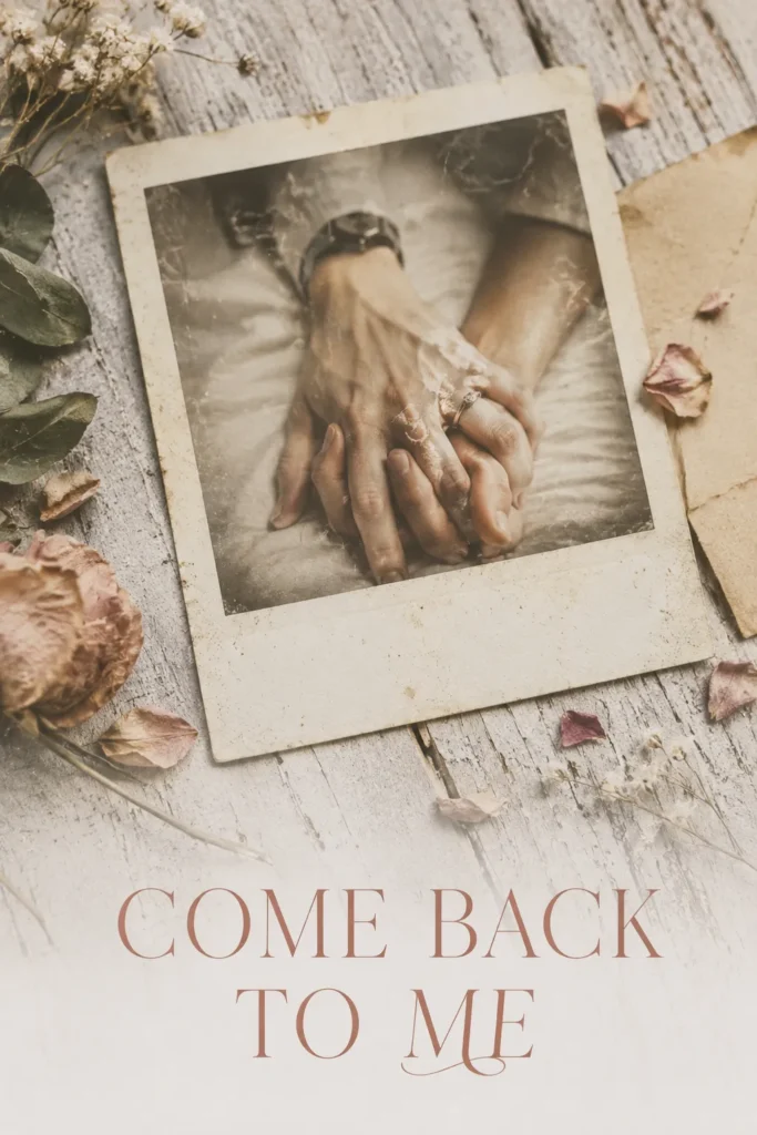
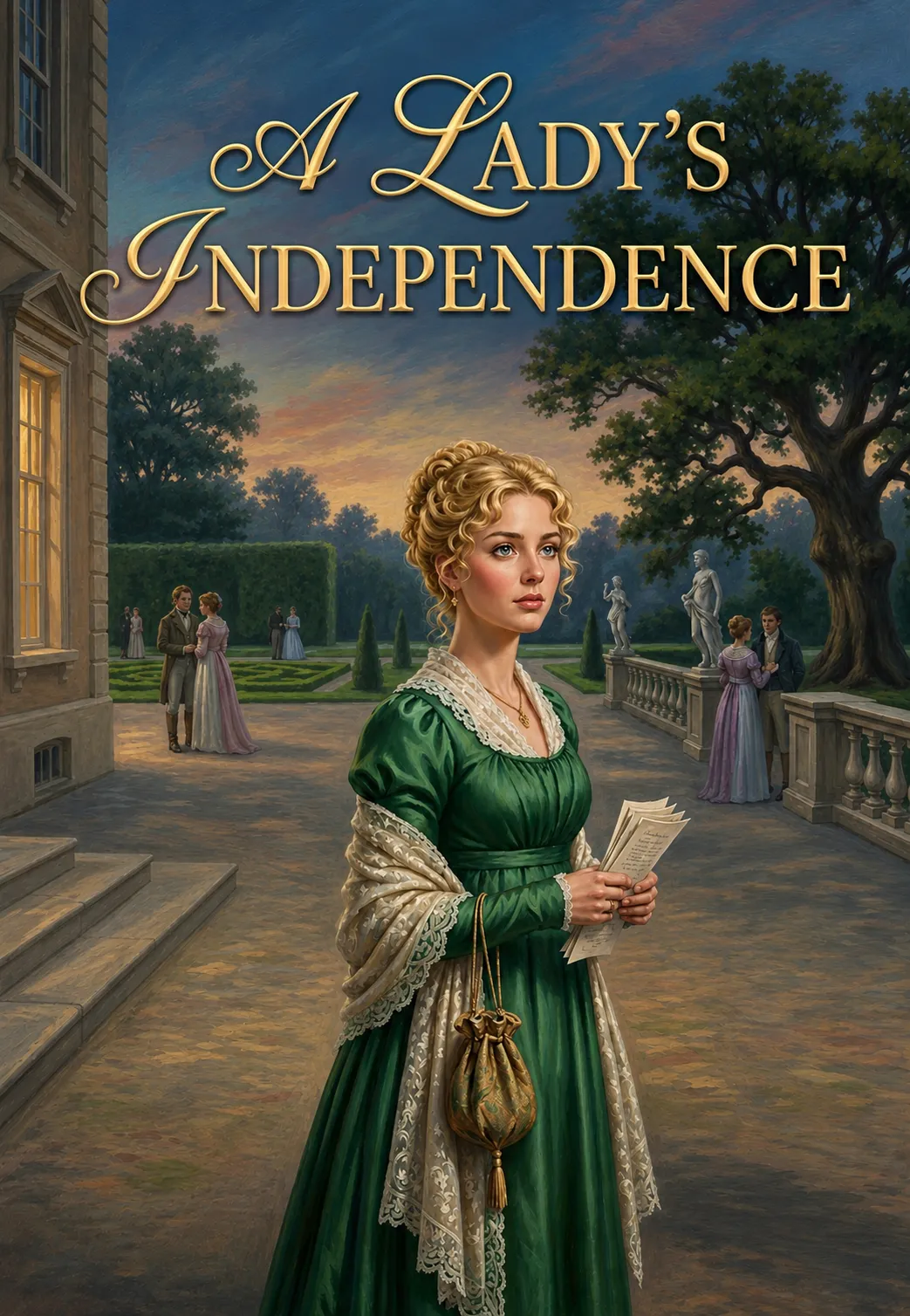
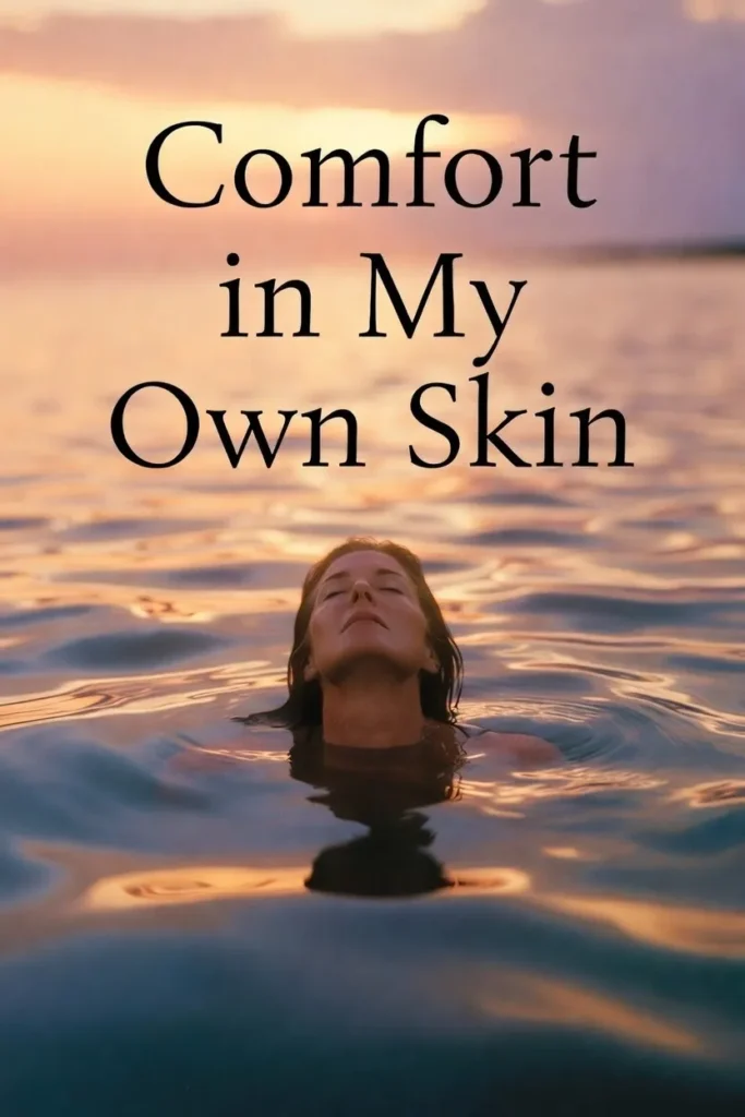
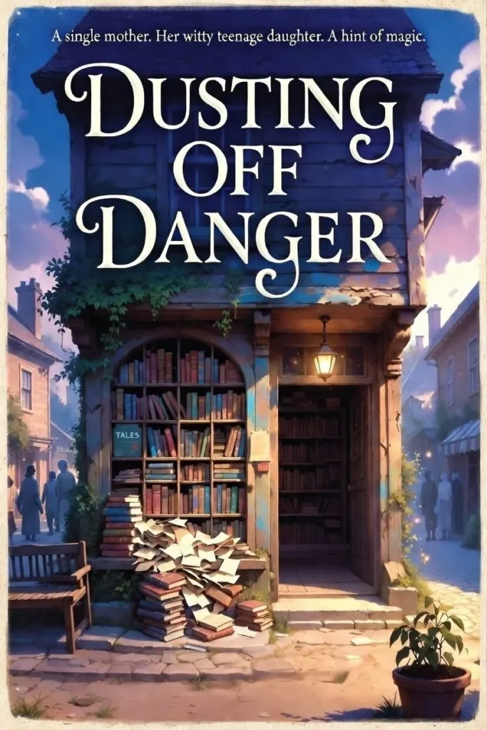
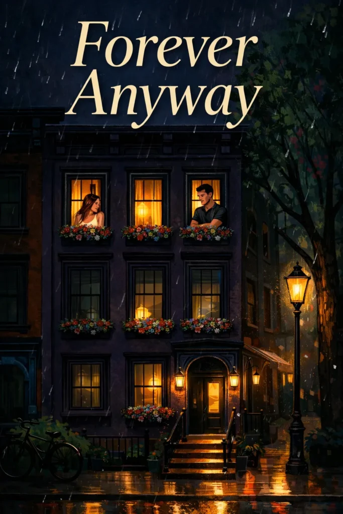
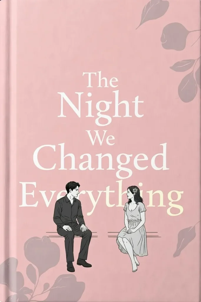
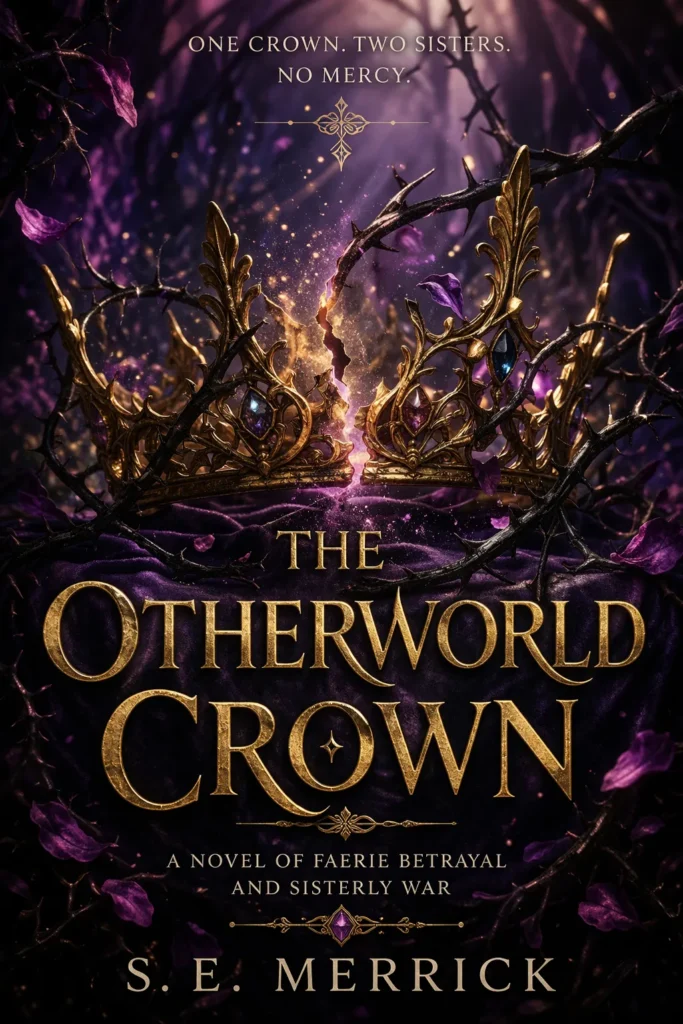
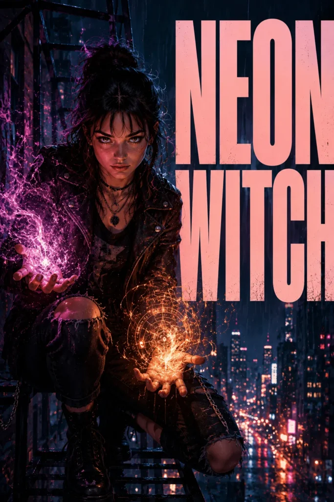
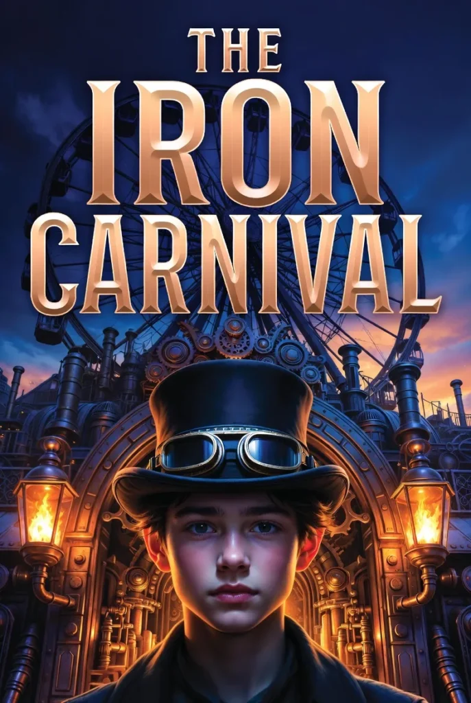
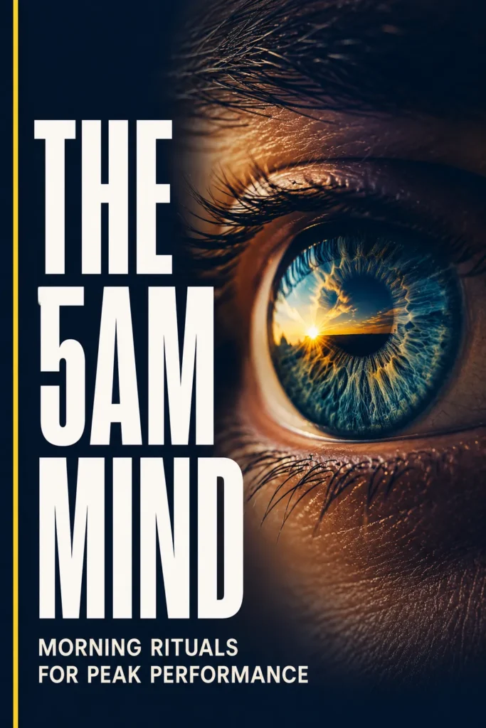
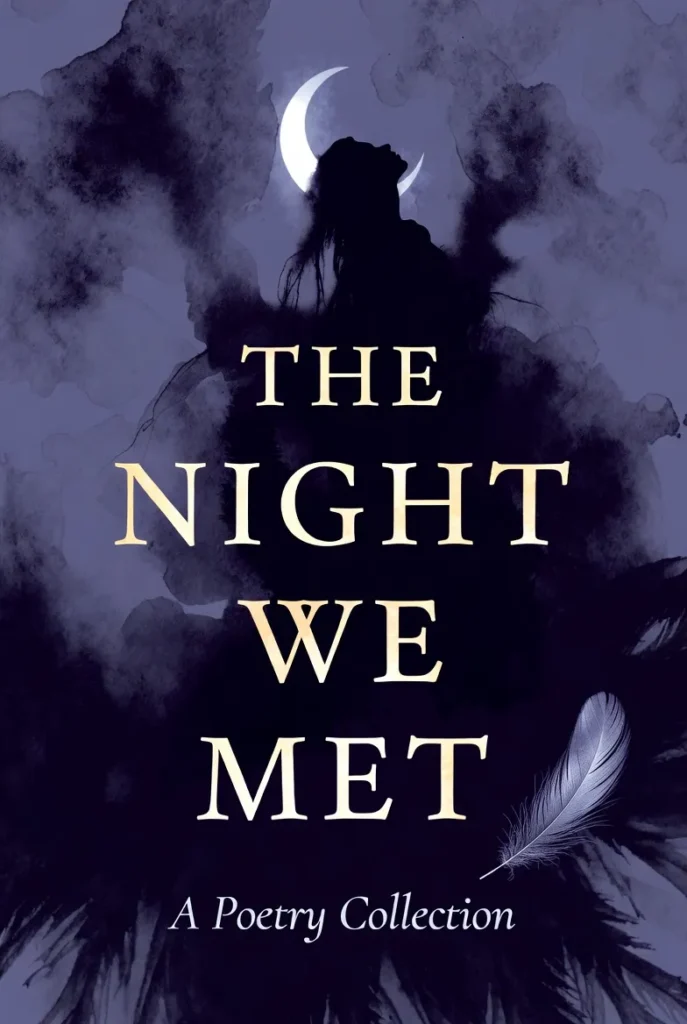
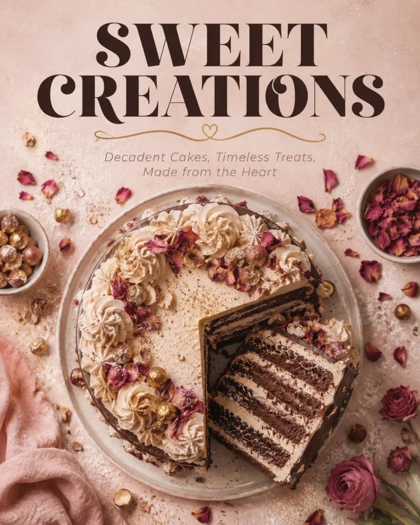
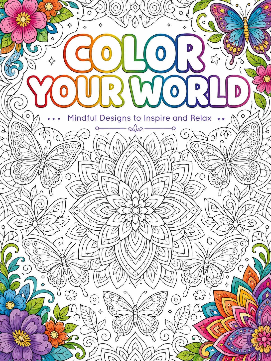
Romance & Romantasy
Emotional intimacy, soft-light intensity
Typography
ForeverScript italics or warm-weight serifs, often with flourish
Color Palette
Warm tones suggesting intimacy and emotional warmth. Romantasy leans darker with metallic accents.
Composition
Centered figure focus with title above, author below
Imagery
Couple silhouettes, soft-focus close-ups, watercolor florals, sunset palettes. The reader scans for emotional vulnerability and chemistry.
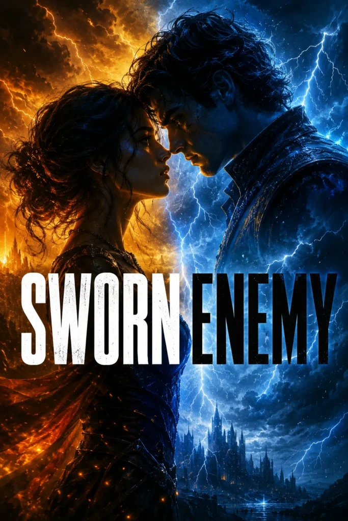
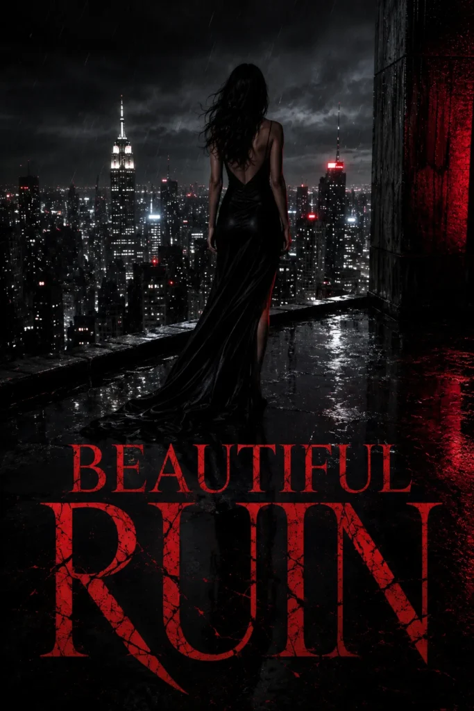
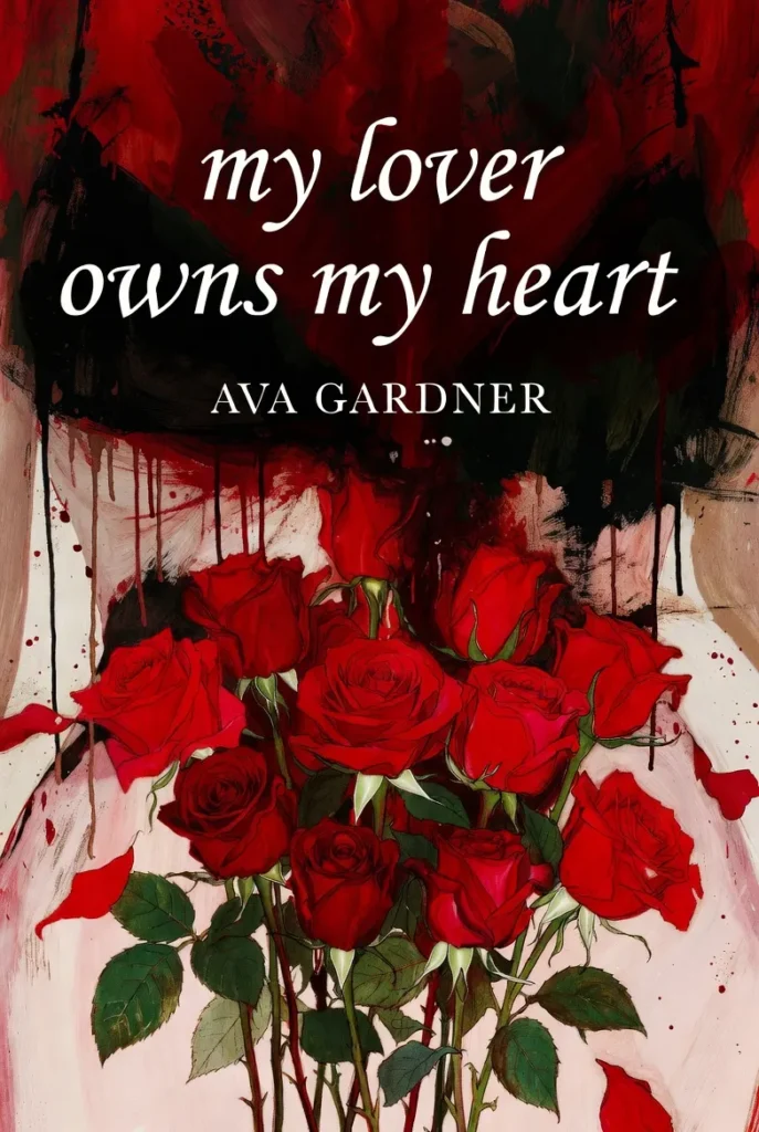
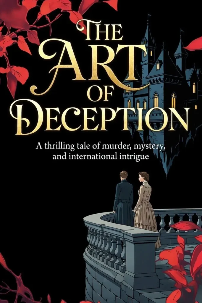
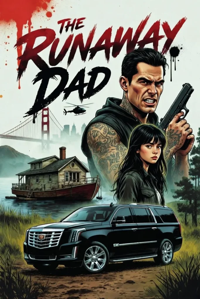
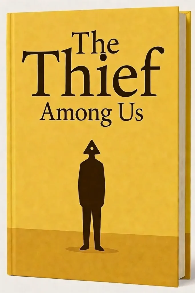
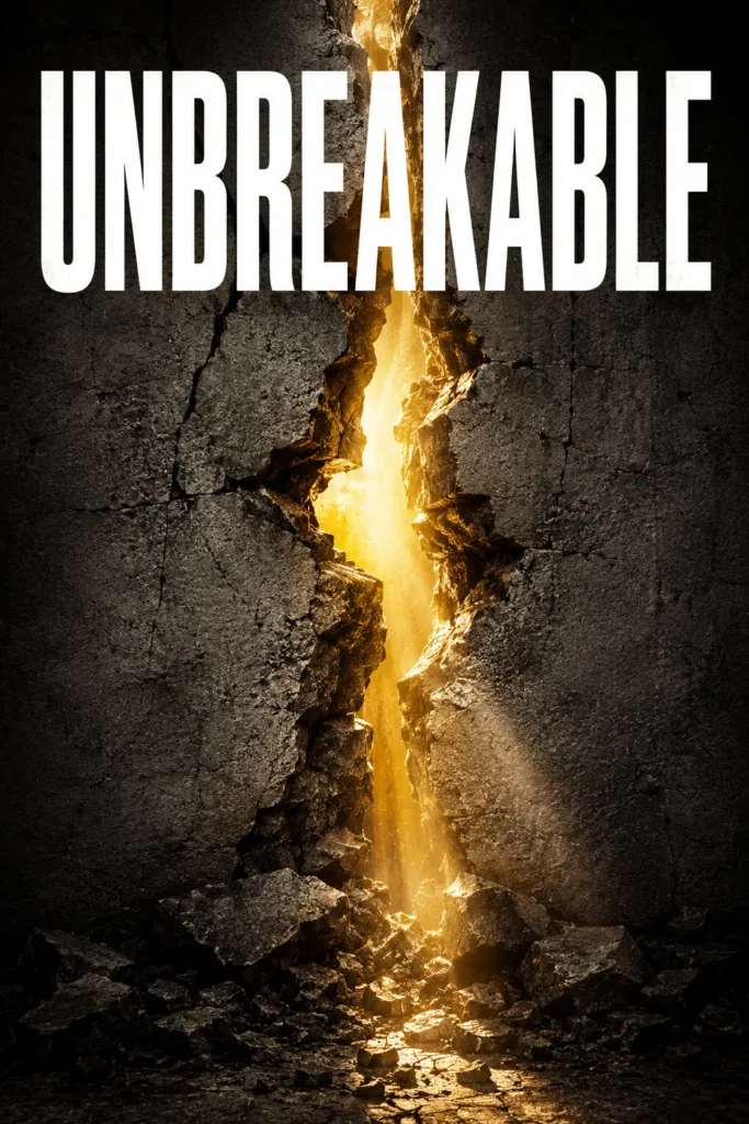
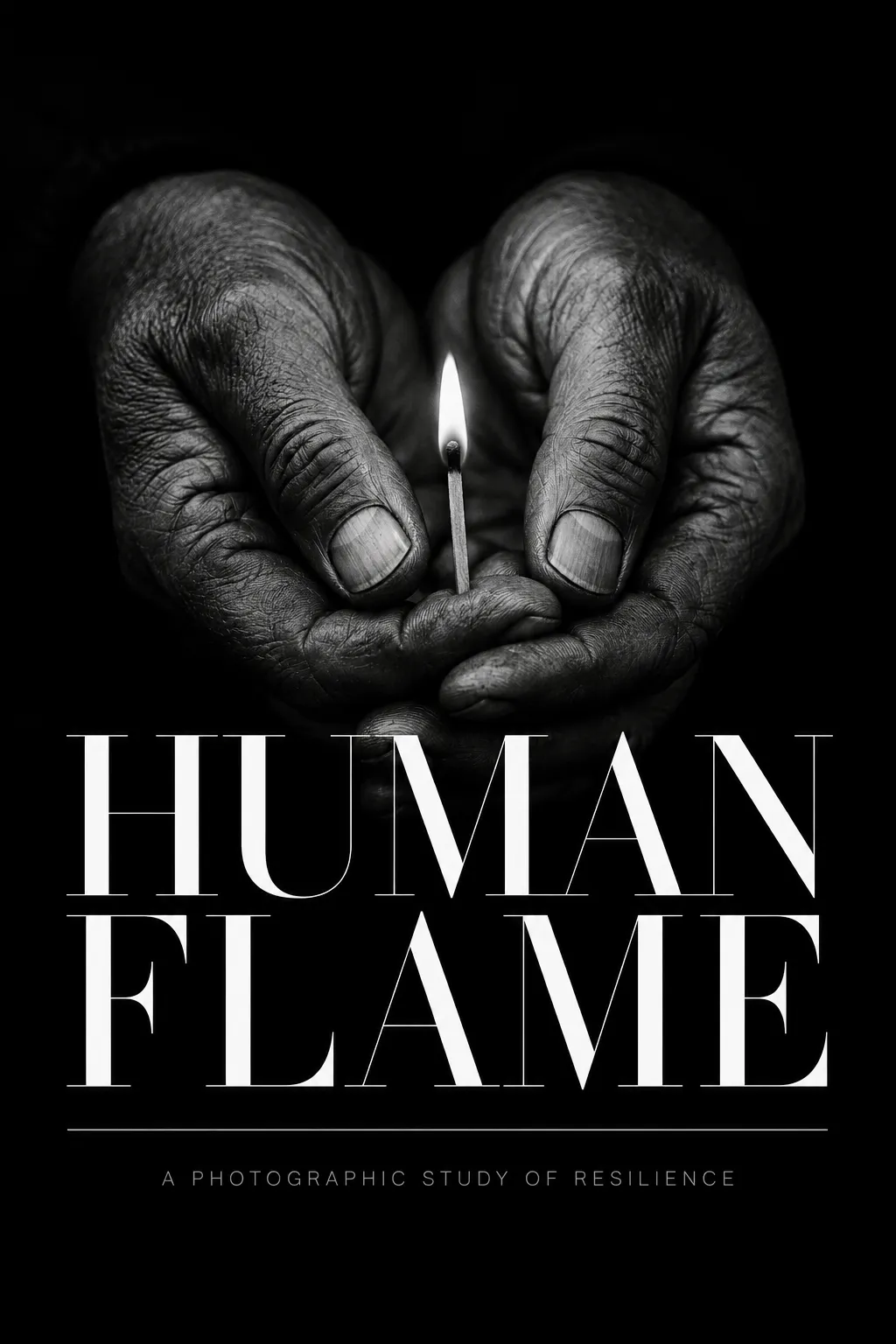
Thriller, Mystery & Suspense
High-contrast tension, single-image impact
Typography
The NightBold condensed sans-serif, all caps, high stroke contrast
Color Palette
Dark backgrounds with single high-contrast accent. Cozy mystery shifts warmer.
Composition
Single dominant image, oversized title at top
Imagery
Lone silhouettes, urban nightscapes at dusk, a single weapon or object isolated. The reader scans for danger and stakes.
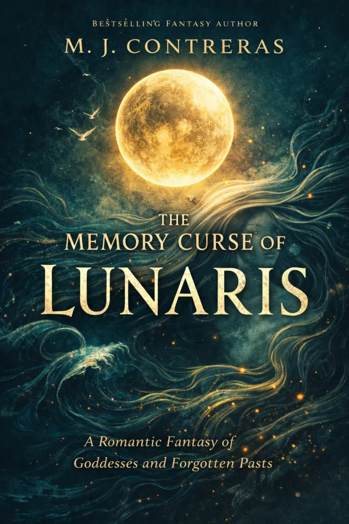
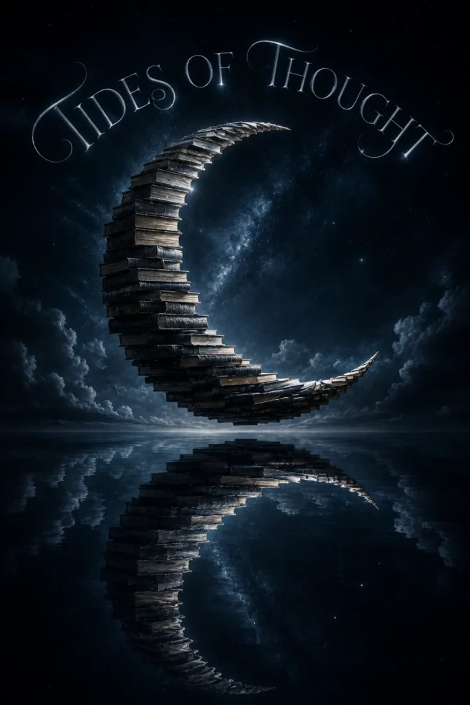
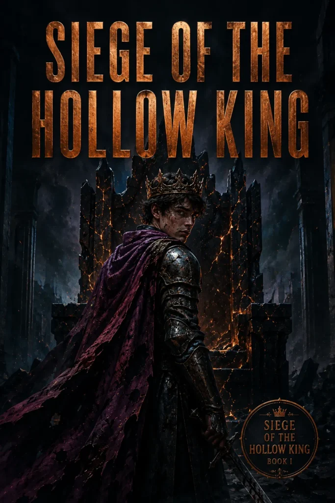
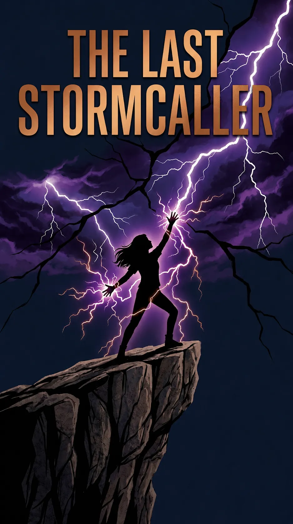
Fantasy & Sci-Fi
World-building, atmospheric scope
Typography
QuestStylized display fonts (Trajan-style fantasy, geometric sci-fi), high drama
Color Palette
Dramatic depth with atmospheric accents, world-building tones
Composition
Sweeping atmospheric scene, dramatic title placement
Imagery
Sweeping landscapes, alien worlds, magical realms. Figures silhouetted against scope. The reader scans for world depth and adventure.
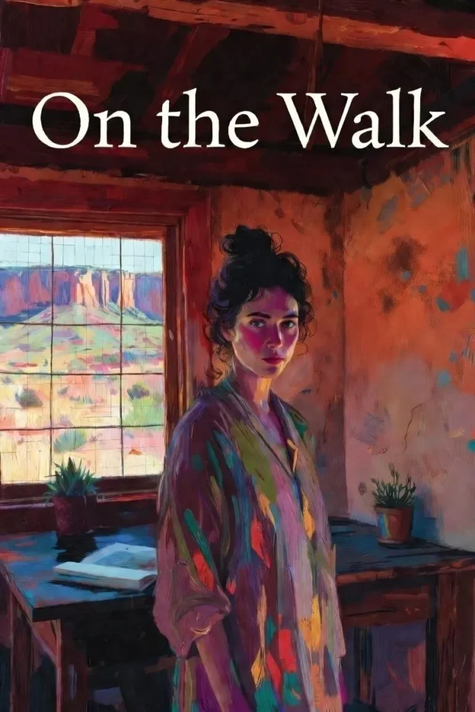
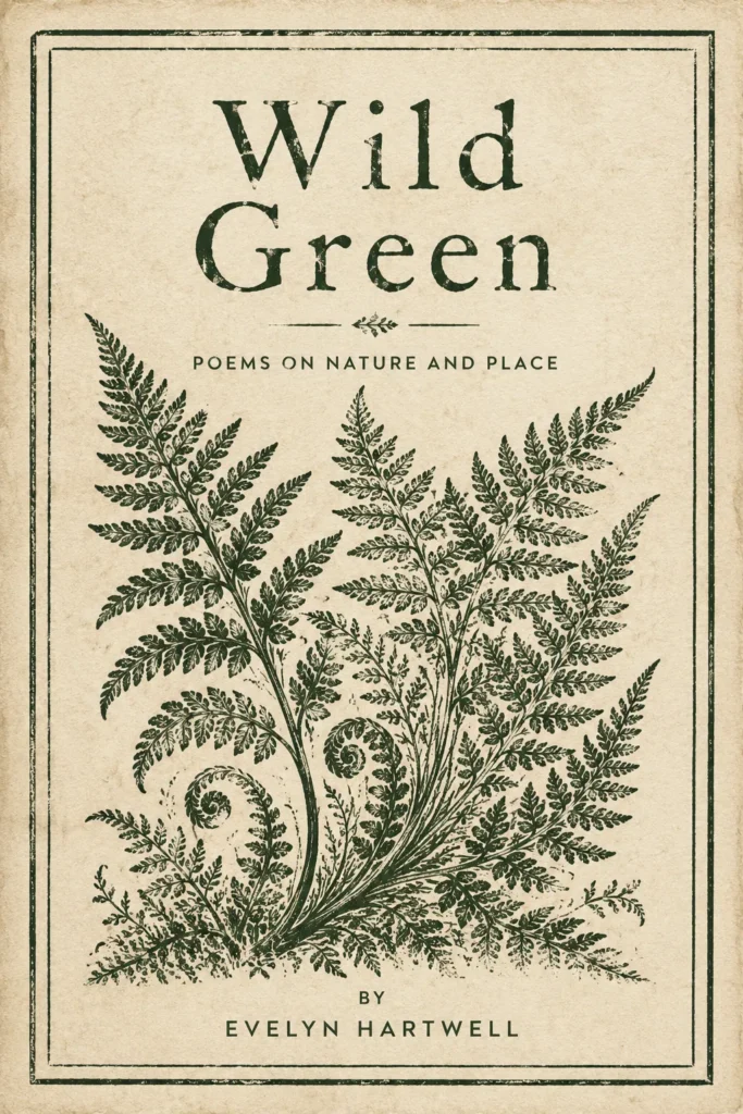
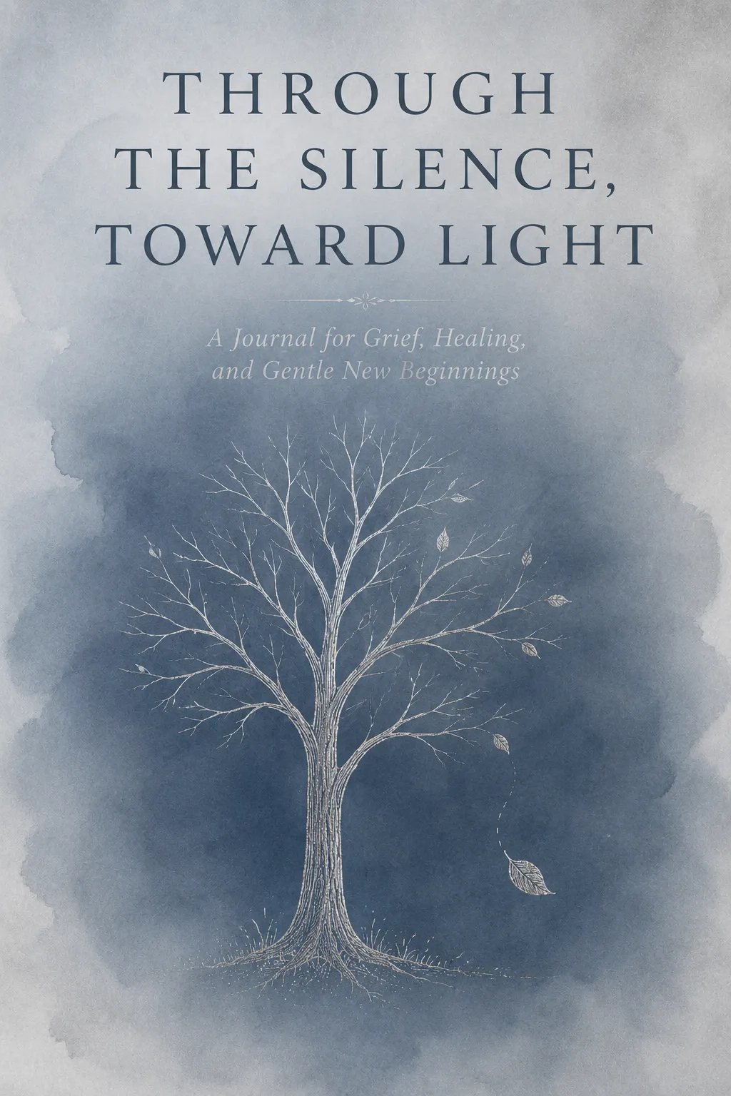
Literary Fiction
Restraint, abstraction, careful negative space
Typography
SolitudeClassic serif, often italic, modest scale, generous letter-spacing
Color Palette
Muted earth tones, abstract and atmospheric
Composition
Generous negative space, modest title scale, abstract focal point
Imagery
Abstract textures, single objects in isolation (chair, doorway, pear), painterly effects. The reader scans for craft, not plot.
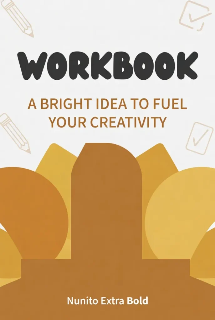
Children’s & Picture Books
Bright illustration, character-first, warmth
Typography
BunnyRounded sans-serif, hand-drawn or playful weight, warm and inviting
Color Palette
Bright primary palette, optimistic and engaging
Composition
Character takes 60 to 70% of cover, large title above
Imagery
Large character illustration with expressive eyes, bright background. Parent and child scan for warmth and repeat-reading appeal.
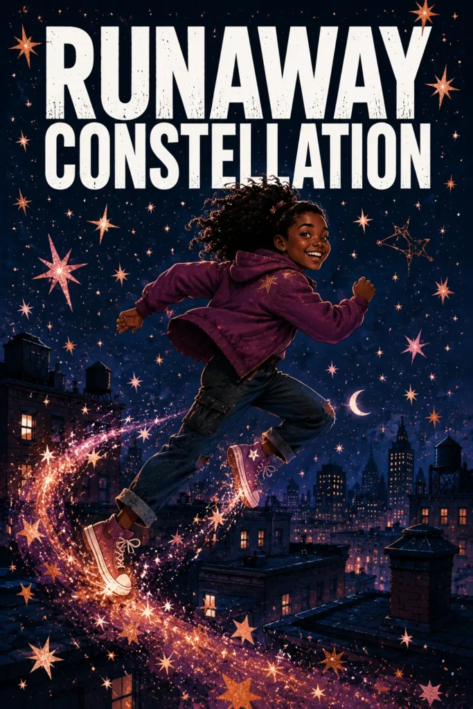
Middle Grade & Young Adult
Bold figure work, saturated palettes, modern type
Typography
WildfireBold modern sans-serif, often condensed, foiled or dimensional treatment on series
Color Palette
Saturated and sophisticated, romantasy and dark academia adjacent
Composition
Figure-forward, tighter crop, atmospheric environmental hint
Imagery
Illustrated or painterly figures of young protagonists, dramatic palettes, foiled title treatments on series. The reader scans for belonging and adventure.
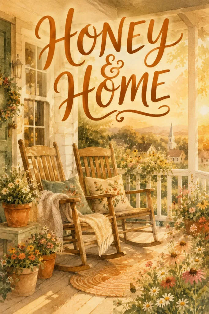
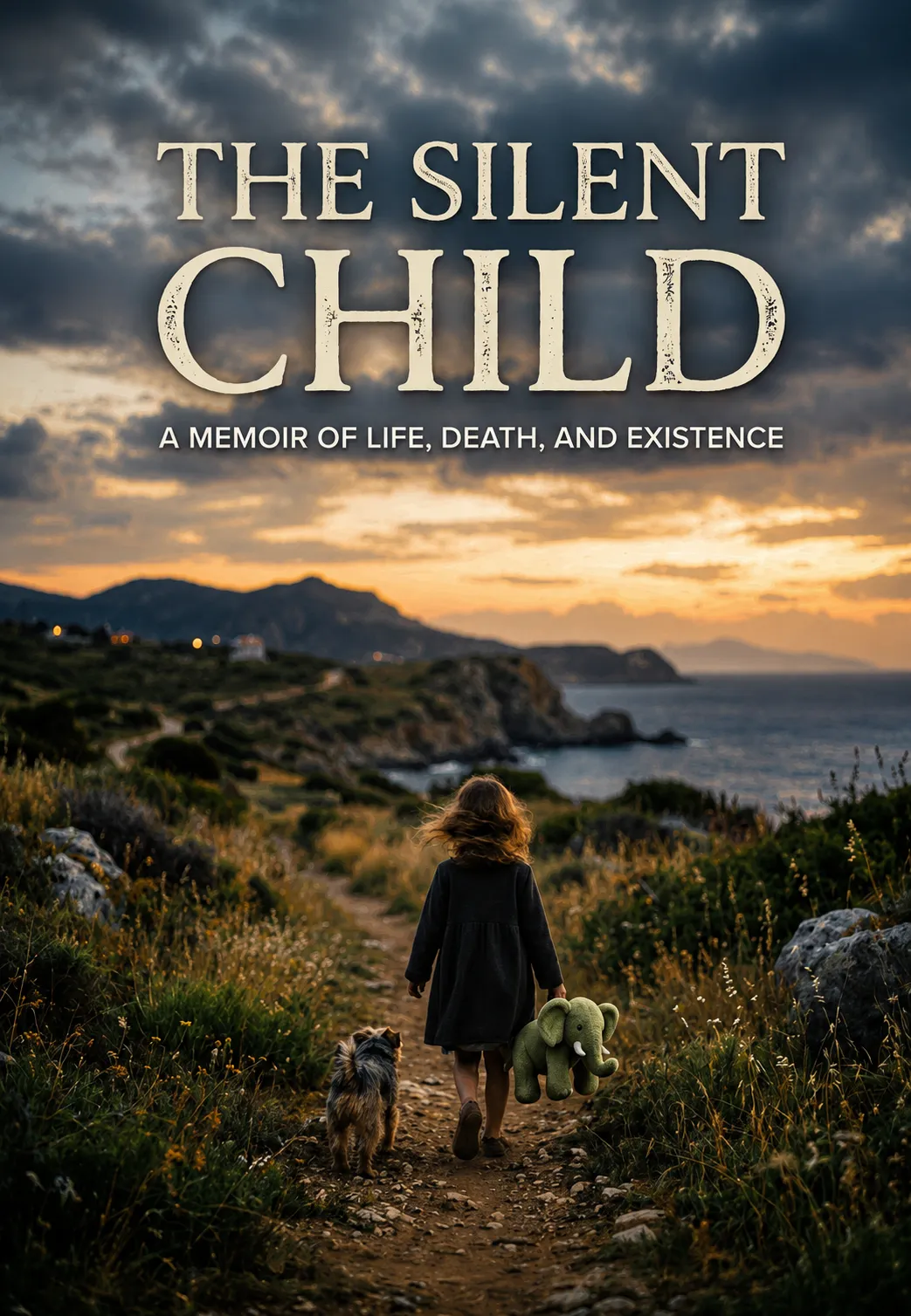
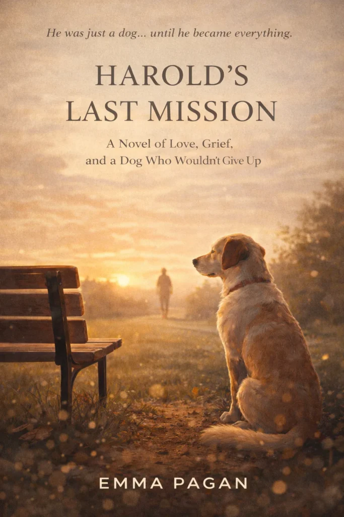
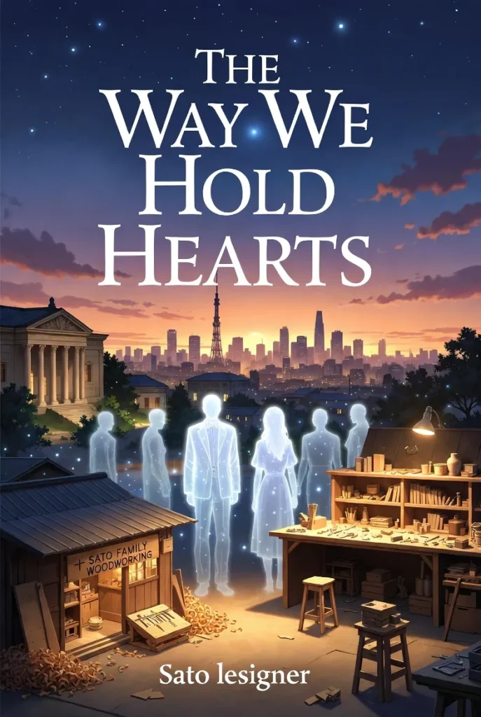
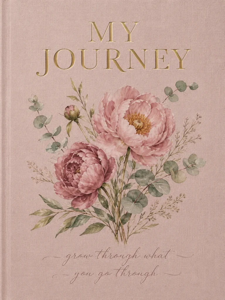
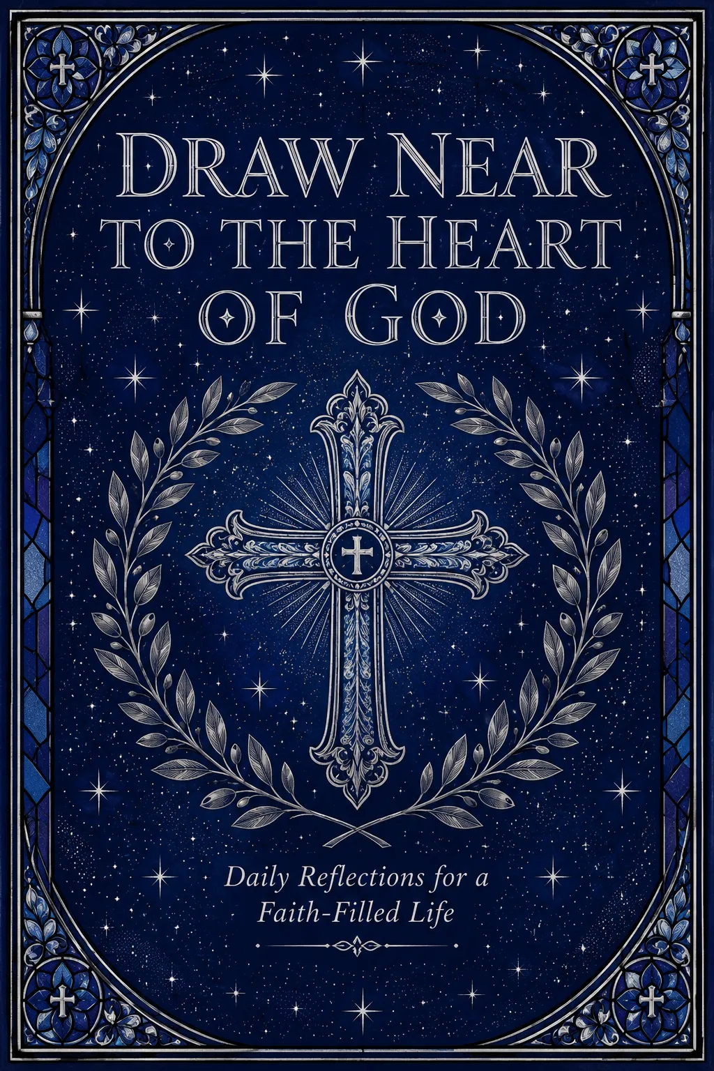
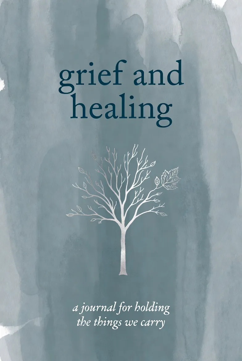
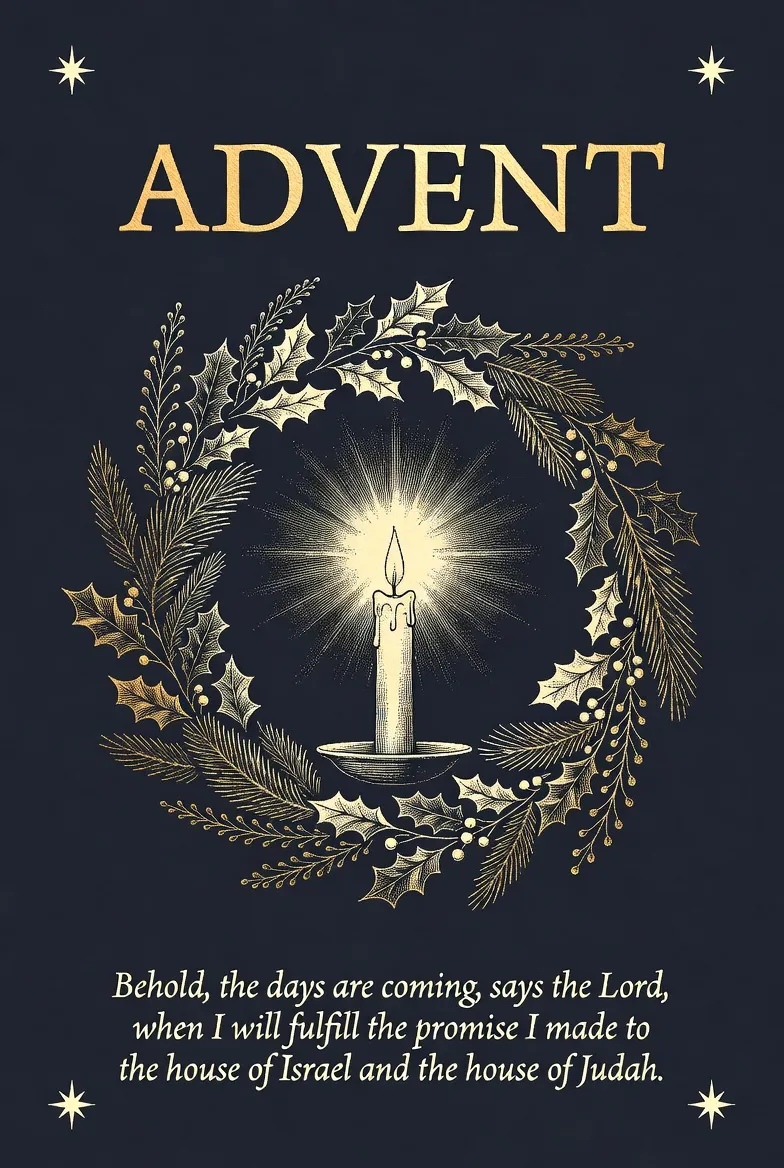
Memoir & Personal Narrative
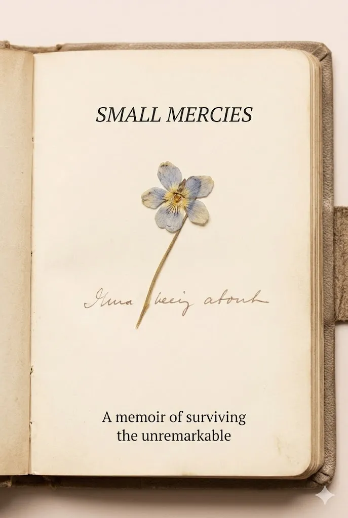
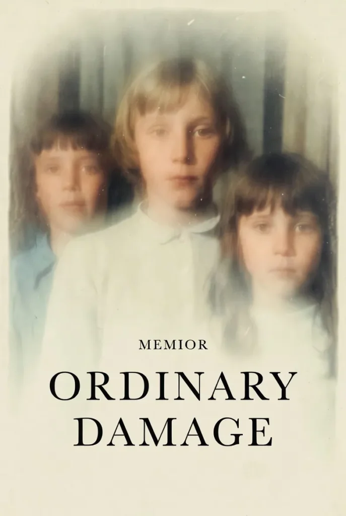
Intimate evidence, personal weight, generous space
Typography
ThresholdClassic serif, often italic, personal weight at modest scale
Color Palette
Sepia and photographic, muted warm undertones, honest and grounded
Composition
Single evocative image, modest title, breathing room around the type
Imagery
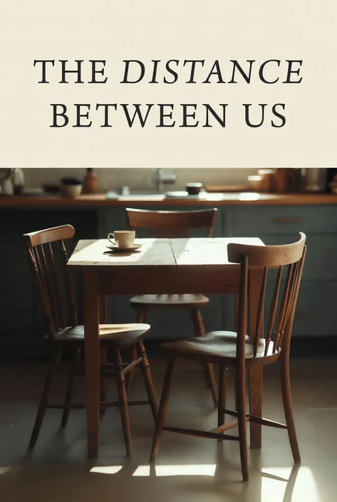
A hand, a window, a horizon, a single object. Photographic or illustrated metaphor. The cover earns trust before the first page.
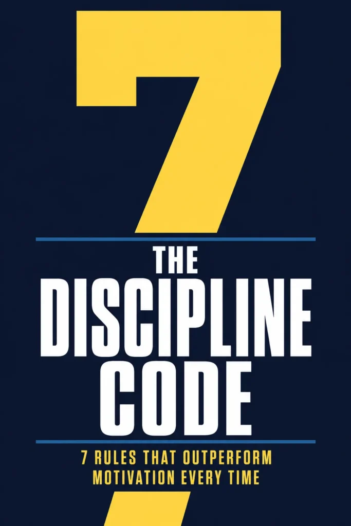
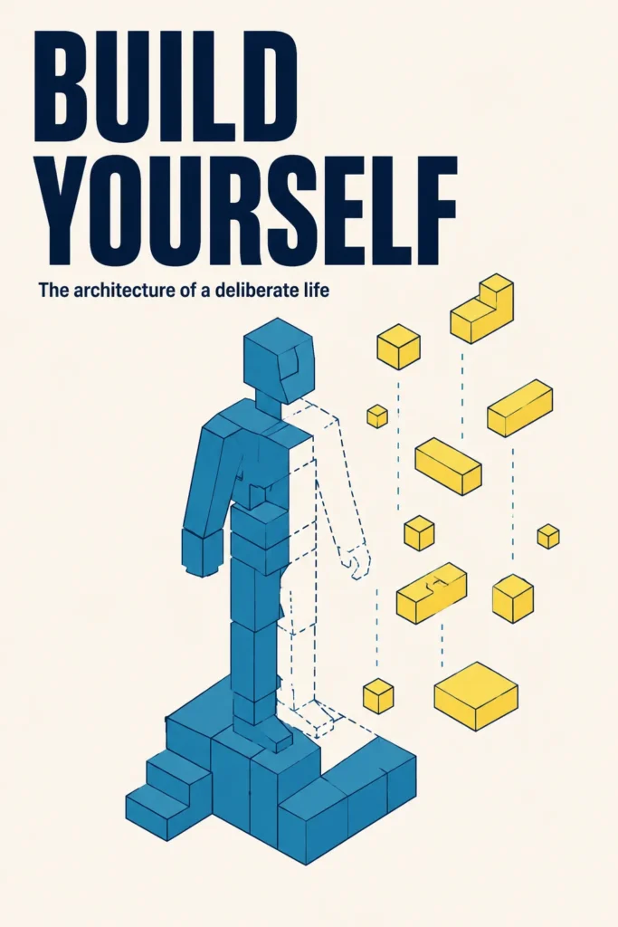
Business & Leadership
Confident credentialing, structured authority
Typography
ConfidenceClean serif or contemporary sans, confident weight at scale
Color Palette
One anchor color against neutrals, expert and trustworthy
Composition
Author photo prominent, title scaled large, clean grid
Imagery
Confident author headshot with strong eye contact and simple background, or a single strong concept-graphic. The reader scans for credibility.
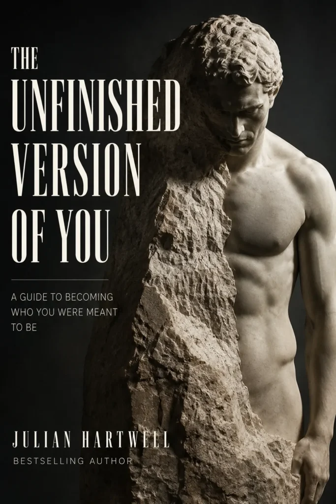
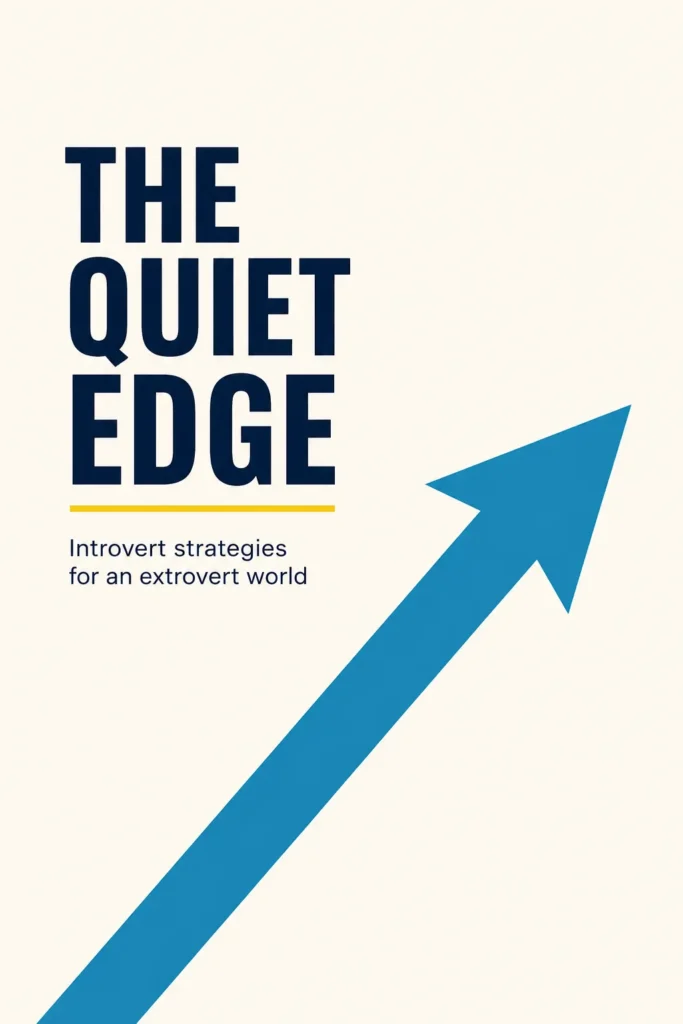
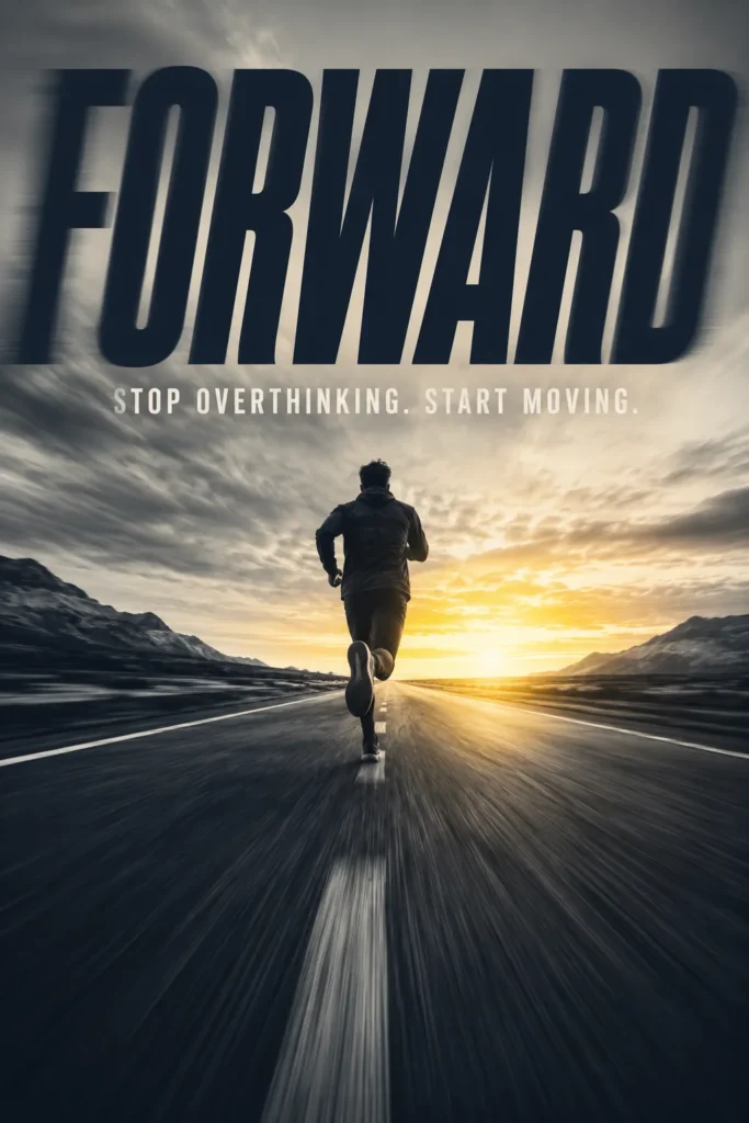
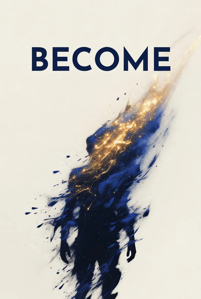
Self-Help & Personal Development
Transformation promise, modern energy, action-cued
Typography
ForwardBold modern sans, tight letter-spacing, structured for transformation claims
Color Palette
Bright accent against neutrals, optimistic and forward-cued
Composition
Bold title with subtitle, simple iconic element, clean grid
Imagery
Bold title structured around a transformation promise, simple iconic visuals or pure typographic covers. The reader is scanning for actionable, not academic.
—HOW IT WORKS
How professional book cover design works step by step
Cover design moves through five stages from the first questionnaire to the print-ready handoff. Each stage exists to remove a specific failure mode, and skipping any of them tends to show up later as a cover that does not convert.
I
Discovery and Creative Brief
The project opens with a structured questionnaire covering genre, subgenre, comp titles, target reader, mood, palette preferences, and any concept the author already has in mind. Three to five comparable titles get pulled from the same Amazon subcategory, and the visual conventions those covers share are documented before any design begins. The brief becomes the reference every revision is checked against.
II
Concept Presentation
The designer presents one to three distinct directions depending on tier, each rendered as a finished comp rather than a sketch. Different concepts solve the brief in different ways. One might lead with typography, another with imagery, a third with a more illustrative direction. The author chooses one direction to take forward. The other concepts are set aside, not blended, because blending tends to produce a cover that solves nothing well.
III
Direction Lock
Once the concept is chosen, the brief is updated to reflect the locked direction and a feedback rhythm is set. Lock matters because cover revisions tend to spiral when the underlying concept keeps shifting. With direction locked, every revision round has a specific job to do, and the author and designer are working on the same cover instead of debating which cover to make.
IV
Revision Rounds
Two to three rounds, depending on tier, refine type weight and hierarchy, color contrast at thumbnail size, image cropping and positioning, and any genre signal reading off-key. Each round is reviewed against the brief rather than personal taste, stays inside the chosen direction, and sharpens the cover with each pass.
V
Print-Ready Handoff
The final cover is delivered in every format the project requires. Ebook sized to KDP, Apple Books, and Kobo specs. Paperback wrap files matched to print trim and spine width calculated from final page count. Hardcover dust jacket if the project includes one. Layered source files are handed over so the author owns the cover outright, including the option to cut marketing assets later or set up a sequel cover that matches.
—investment
Book cover design pricing: $199, $399, or $999
Three tiers, scoped by deliverables and revision depth. Same designers across all tiers. The difference is what the project includes, not who makes it.
Three tiers compared at a glance
Same designers, same process, different scope. Choose by format coverage and revision depth.
| Feature |
Starter $199 Ebook-only release Choose Starter |
Most Popular
Growth $399 Ebook + paperback + hardcover Choose Growth |
Authority $999 Custom illustration, full suite Choose Authority |
|---|---|---|---|
| Scope and timeline | |||
| Best for | Ebook-first launches, concept testing | Standard print and ebook releases | Series, brand-building, premium categories |
| Formats delivered | Ebook (KDP, Apple, Kobo) | Ebook, paperback, hardcover | Ebook, paperback, hardcover, marketing |
| Typical timeline | 7 to 10 days | 7 to 10 days | 10 to 14 days |
| Design and revisions | |||
| Cover concepts presented | One direction | Two directions | Three directions |
| Revision rounds | Two rounds | Three rounds | Unlimited within locked direction |
| Imagery | ✗ | Stock photography, single license | Custom illustration commissioned |
| Print-ready wrap files | ✗ | ✓ | ✓ |
| Series and marketing | |||
| Series branding setup | ✗ | ✗ | ✓ |
| Marketing asset package | ✗ | ✗ | ✓ |
In every tier
- Structured discovery phase
- Layered source files at handoff
- Full ownership of the final files
Results vary by genre, market conditions, and the marketing applied to the launch. AuthorWings does not guarantee specific sales outcomes from cover design alone.
—PRINT-READY SPECS
Print-ready specifications most cover designers skip
A cover that looks beautiful on screen can still fail at the printer. The technical layer is where amateur work gets exposed, and it is the layer professional book cover design services are quietly built around.
The first failure is bleed. Print files need the artwork extended past the trim line on every edge, typically 0.125 inches, so that when the page is cut the color runs cleanly to the edge. Files delivered without bleed produce a thin white border on one or more sides of every printed copy. The author sees it for the first time when the proof arrives, and by then the cover is already ordered.
The second failure is spine width. Spine measurements are calculated from final page count, paper weight, and trim size, and the math is different on KDP than it is on IngramSpark because the two presses use different paper stock. A cover designed against an estimated spine almost always misses by a millimeter or more. The title creeps onto the front, the author name slides onto the back, and the cover comes back looking misaligned in a way readers register without being able to name.
The third failure is color profile. Screens render in RGB, presses print in CMYK, and a saturated red on the screen can drop dull on the printed page when the file is converted at the wrong moment. Professional cover files are built in CMYK from the start for print versions and exported in RGB only for ebook delivery, so what the author sees in the proof matches what the designer approved.
The fourth failure is resolution. Cover artwork has to hold at 300 DPI at full print size, including any imagery scaled or cropped from the original. A stock photo licensed at the wrong size pixelates on a 6 × 9 paperback. Custom illustration is commissioned at print resolution from the start. Either way, the file is checked at 100% zoom before delivery, not at the screen-fit zoom level where flaws hide.
The fifth failure is platform spec drift. KDP, IngramSpark, Apple Books, and Kobo each publish their own cover guidelines, and the guidelines update without notice. A file that passed validation last year can fail validation this year on the same platform. Print-ready handoff includes current-spec validation against each retail platform the project ships to, so the cover uploads cleanly the first time instead of bouncing back for a fix.
—Compare
Five places to hire cover design, compared
Cover design comes from one of five places, each with its own price-quality trade-off. AuthorWings is built to deliver the protections of a boutique studio at the pricing of an indie service.
Five places to hire cover design, compared
All of them will hand you a cover. The difference is what the quote includes, and what you own afterwards.
Boutique studios score the same six out of six — at eight to twelve times the price. That gap is the whole argument.
Scored on six things: source files included, revision rounds defined in the contract, genre research before concept work, freedom to switch designers, a designer matched to your genre, and proof copy review on the actual retail platforms. Price ranges reflect typical published rates for book cover design, benchmarked across each option type's public service tiers.
—Frequently Asked Questions
Book cover design questions authors actually ask
The questions that come up repeatedly during the cover design conversation, answered the way a designer would answer them after the call.
How much does book cover design cost?
Book cover design at AuthorWings runs from $199 to $999 across three tiers. The $199 Starter tier covers an ebook-only design, the $399 Growth tier adds print-ready paperback and hardcover wrap files, and the $999 Authority tier commissions custom illustration with series branding. Every tier includes the discovery phase and the layered source files you keep. Across the wider market, cover design ranges from a few dollars on gig platforms to several thousand at boutique studios, and the tier you need depends on how many formats you are publishing in and how much revision depth the project calls for.
What if I already have a cover concept in mind? Can the designer work from my idea?
Yes, and most projects start exactly this way. The discovery questionnaire has a section for the author's own concept, mood board, or reference covers. The designer's job is to test that concept against genre conventions and execute it at professional quality, or to flag where the concept may not perform on the category page and propose adjustments. The author's vision is the starting point. The designer's expertise is what gets it to a finished cover that converts.
What happens if I do not like any of the presented concepts?
The discovery process is designed to prevent that, but if the first round of concepts does not land, the brief gets revisited rather than the design pushed forward. Usually the disconnect traces back to a mismatch in the brief, like comp titles that did not actually represent the book, or a mood description that read differently to the designer than to the author. Once the brief is corrected, the next round of concepts is on a different track. No project moves into revision rounds on a direction the author is unsure about.
Can I provide my own photography or illustration?
Yes, with two conditions. The image needs to be high-resolution, ideally 300 DPI at full print size, and the author needs to hold the rights to use it commercially on a book cover. Family photos, AI-generated images with unclear licensing, or images pulled from the internet without rights are not usable. If the author has commissioned illustration or licensed stock, those work. The designer integrates the image with type, layout, and any additional elements the cover needs.
Why does my cover look different on my phone than on my computer?
Color profiles. Phone screens, computer screens, and printed books all render color differently. A cover designed in CMYK for print will look slightly different on a screen calibrated to RGB, and the same cover viewed on an iPhone OLED will look different from the same cover on a laptop LCD. The cover is built to perform in the format it will be sold in, which means ebook covers are optimized for screen rendering and print covers are optimized for the press. The differences across screens are normal and expected.
Do I own the rights to my book cover after the project?
Yes. The author receives the final cover files and the layered source files at delivery, and uses the cover for any commercial purpose related to the book, including the ebook, paperback, hardcover, audiobook, marketing, sequels, and merchandise. Stock imagery licensed inside the cover comes with usage rights that pass through to the author's book usage. Custom illustration commissioned at the Authority tier transfers fully to the author. The cover is the author's to use, not rented.
How is series branding handled?
Series branding sets up a visual system that holds across every book in the series: a consistent type treatment, a recurring color logic, a shared composition rule, and a layout that signals "Book 2," "Book 3," and so on without redesigning from scratch each time. The Authority tier includes series branding setup. For Starter and Growth tier projects, series branding can be added as a custom scope, or the original cover files can be used as the visual reference for matching covers later.
What if the print proof comes back looking wrong?
A print proof that looks wrong almost always traces back to one of four issues: bleed not extended properly, spine width calculated against the wrong page count, color profile drift between the design file and the press, or a low-resolution element in the artwork. The print-ready handoff includes file QA against each of these, so the most common print problems are caught before the file ships. File errors traced to design issues are corrected as part of the project scope.
Can I commission a cover before my manuscript is finished?
Yes for ebook-only Starter tier covers, with caution for Growth and Authority tier projects. The reason is spine width. Paperback and hardcover wrap files are calculated from final page count, and starting the cover before the manuscript is locked means the spine math has to be redone if the page count shifts. For ebook-only covers, the manuscript timeline does not affect the design, and many authors commission the cover early to use in pre-launch marketing.
Do I need a separate cover for the ebook and the print paperback?
Yes. Ebook covers and print covers are built to different specifications, so the same design has to be delivered as two different files. An ebook cover is a single front-facing image sized for screen display on KDP, Apple Books, and Kobo. A print cover is a full wrap that includes the back cover, the spine, and the front, with the spine width calculated from your final page count and bleed added on every outer edge. The Growth and Authority tiers deliver both. The Starter tier delivers the ebook file only, which suits an ebook-first launch.
Can you redesign a book cover I already have?
Yes. A redesign runs through the same discovery process as a new cover, starting with why the current cover is underperforming: a genre signal that reads wrong at thumbnail size, typography that looks self-published, or a design that no longer fits the book. The brief then sets the direction for the new cover, and the tier is chosen by the formats you need delivered. If you own the layered source files from the original cover they can speed the work, but they are not required to start.
Will my cover look like other AuthorWings covers?
No. Every cover starts from the author's brief, the author's genre, and the author's comp titles, not from a template or a designer's pre-existing style. The studio works across genres and visual registers, and a romance cover, a thriller cover, and a memoir cover from the same studio look like books in three different categories, because each one is designed against the conventions that category rewards. The shared element is process, not aesthetic.
How fast can I get a cover if I am on a tight deadline?
Standard turnaround runs about 7-10 days for Starter and Growth tier and 10-14 days for Authority tier. Faster is possible on a case-by-case basis depending on designer availability and the scope of revisions, with quick response from a real human at the contact stage. The honest answer is that a great cover takes the time it takes, and rushing the brief or the revision rounds is the fastest way to end up with a cover that needs to be redesigned six months later.
Next Steps
❦Get a cover briefed against your exact subgenre
A cover built for the thumbnail test is what gets the book opened on a crowded shelf. Every project is briefed against three to five comp titles in your exact subgenre, priced from your trim size and finish (paperback, hardcover with jacket, or ebook-only), with full ownership of the files at delivery. Book a call and your first reply schedules you with a cover design specialist on the team, not a sales agent.
Mutual NDA available before the call on request. 100% rights retention guaranteed. No contracts until you decide.
AuthorWings· Transparent Pricing · 100% Your Rights
Last updated: July 2026